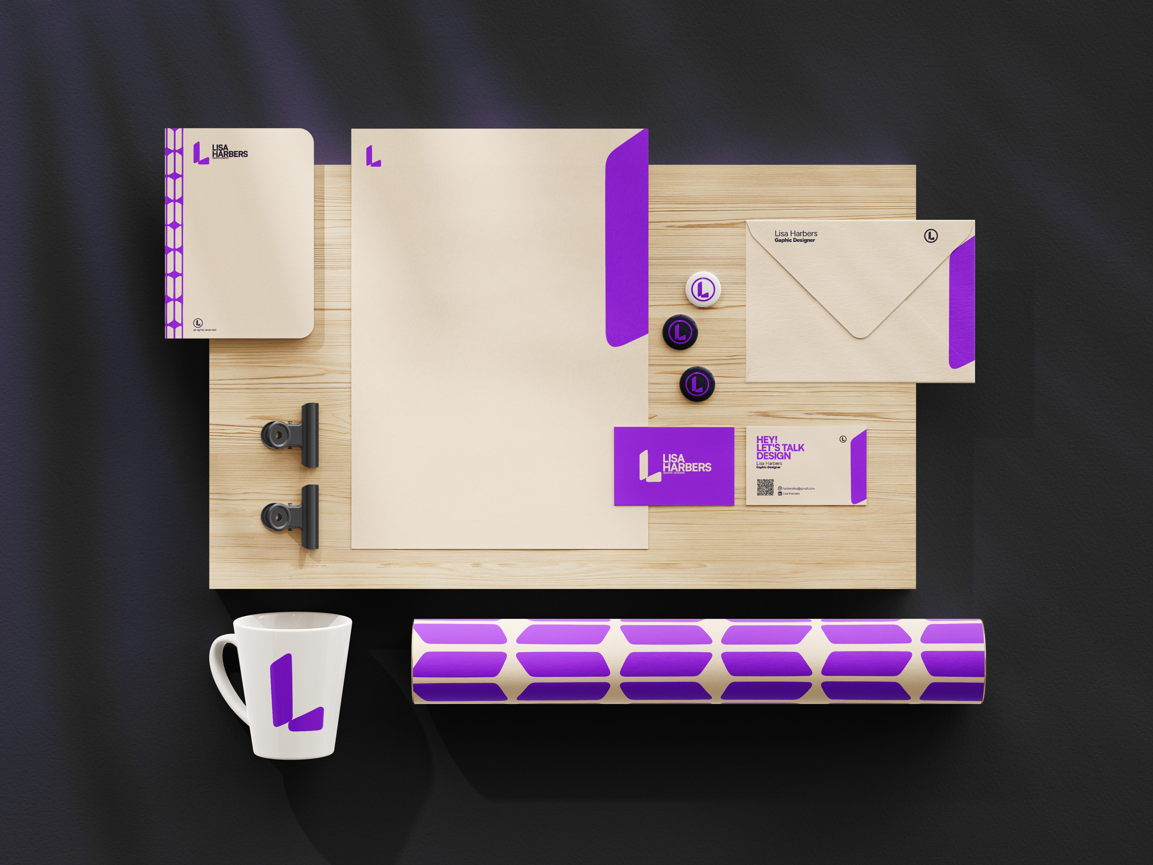
Inspiration & Concept:
High-Energy, Systematic Design
My personal brand is deeply inspired by the structural clarity and vibrant energy demonstrated in the work of Sebas Baldeón. I was
drawn to his systematic approach and the visually appealing organization of his identity, which has served as a foundational model
for my own design philosophy.
My identity is built around the intersection of high saturation and structured precision, reflecting a dynamic yet meticulous approach
to digital and creative work. The goal is to be instantly recognizable, modern, and highly legible.
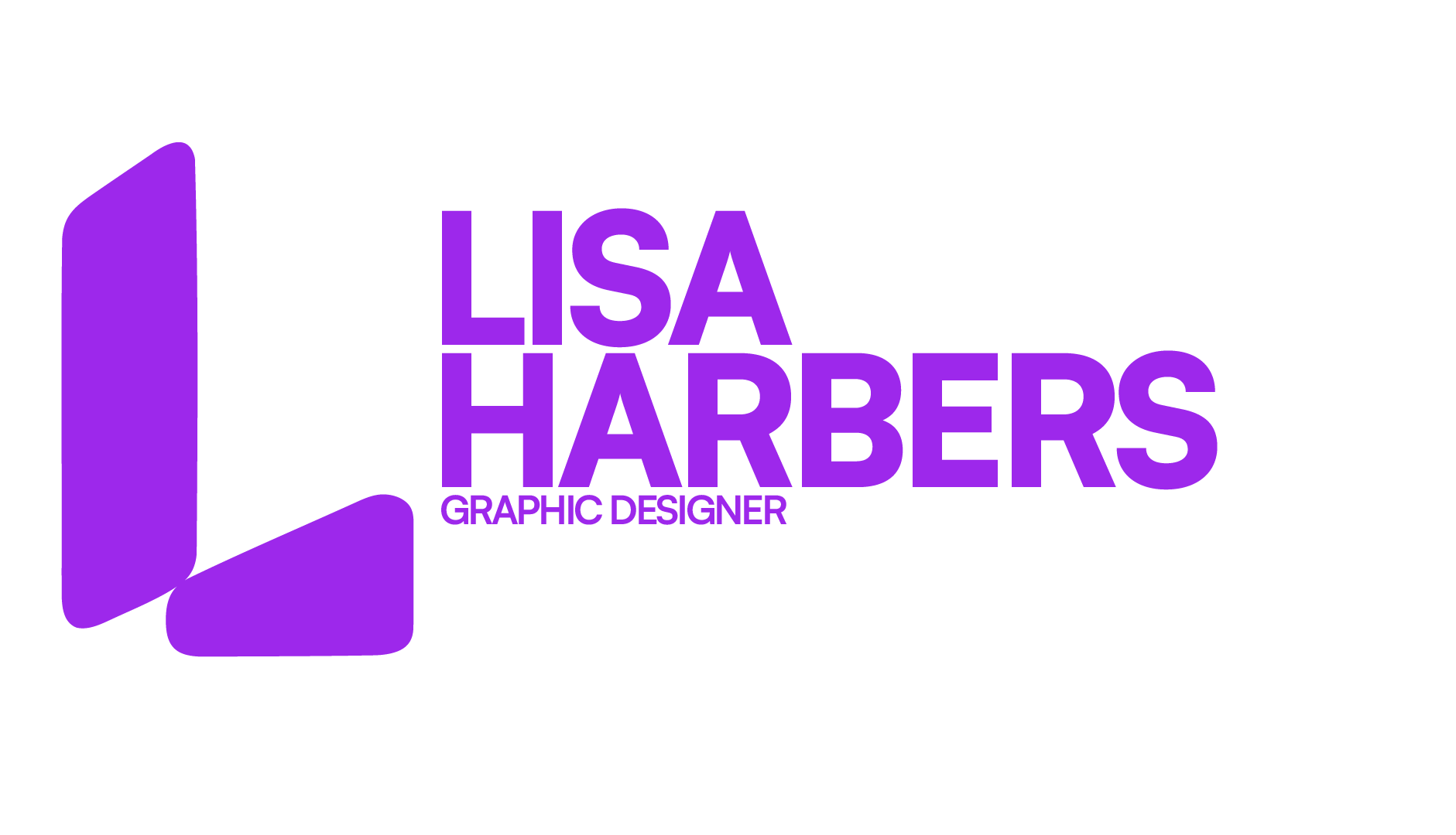
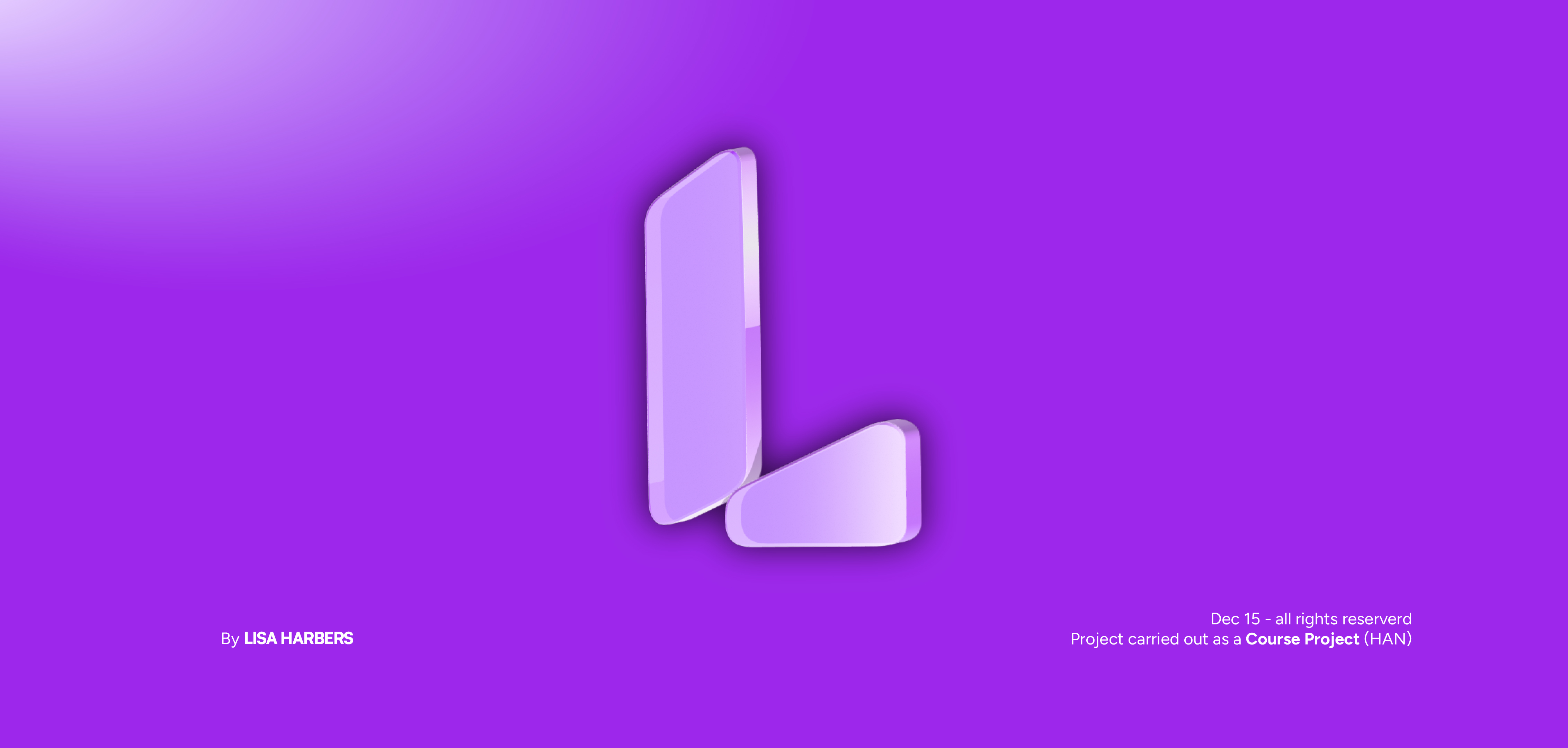
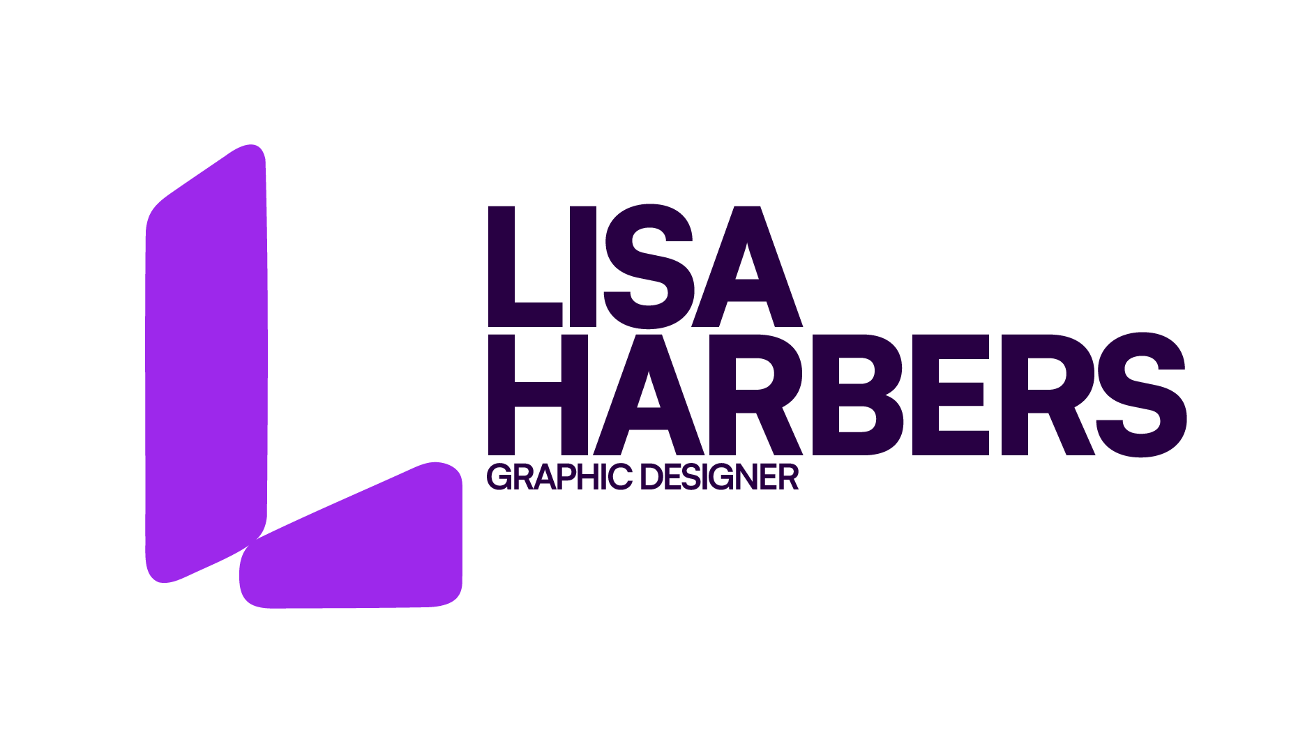
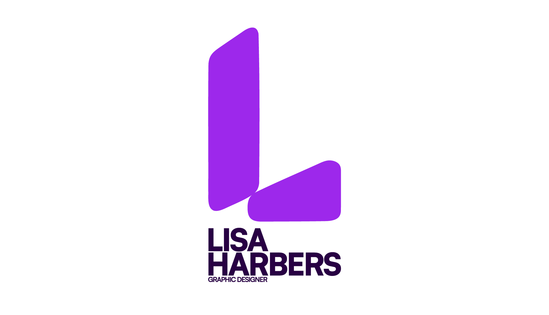
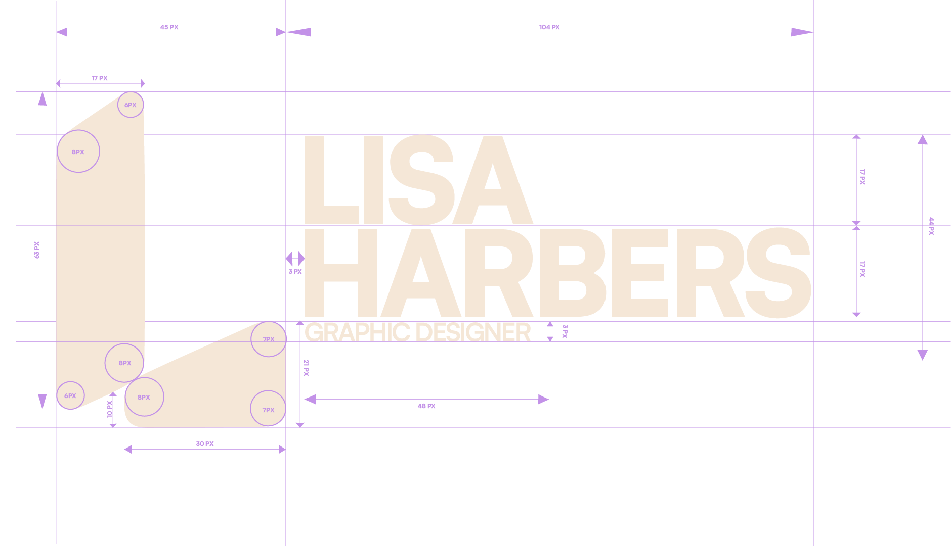
Logo Design Principles
The creation of the primary logo, based on the letter 'L,' was guided by the following principles to ensure it is memorable and effective:
Key Marks: Based on the Letter L.
Forms: Incorporate shapes like a star, crescent moon, or sharp lines that are easily transferable into the website design.
Aesthetics: Maintain a Professional/minimalist appearance.
Originality: Feature rounded corners/friendlier appearance and an Original/unique appearance.
Feel: Convey a sense of Peace (Rust).


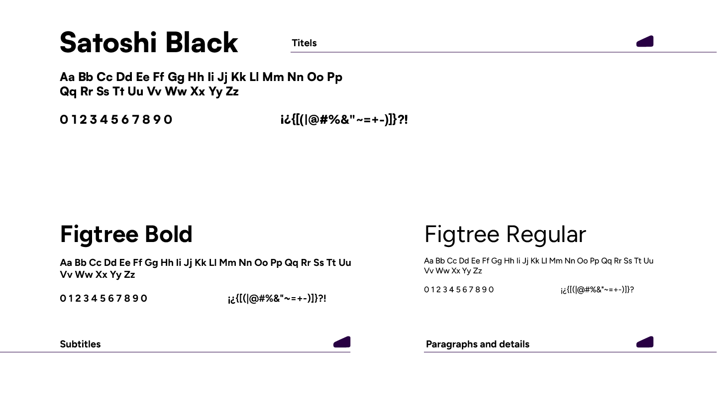
Typography
The identity utilizes a clean, modern type hierarchy for maximum impact and legibility.
Primary Accent/Impact:Satoshi Black is used for headlines and key statements, providing a bold, contemporary feel.
Supporting Typeface: Figtree is used in its Bold and Regular weights for body copy and supporting text, chosen for its accessible
structure and high legibility.
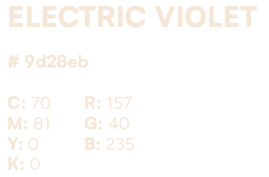
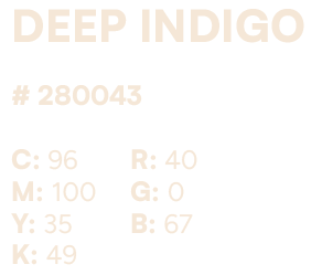
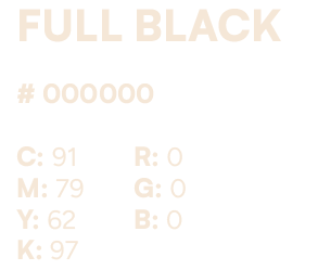
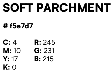
Color Palette: Digital Intensity
The palette is designed for impact, combining highly saturated, energetic tones with grounding neutrals and deep blacks, adapted directly from the defined color codes.